You can never go wrong with gray
Gray. The color of ash, cold concrete and the sky under stormy sea. The color of winter dawn and fog over the wrinkled landscape. The color of sad memories and the fragile crusts of a frozen pond. Perhaps none other than shades of gray awaken so much negative emotions in us. Nevertheless, in the interior, this color thrives and it would be a shame to shun it. For whom, when, and how is it applicable? Precisely, when is gray in the interior too much?
“Monochrome interiors are usually the wishes of single men. Gray is the most common color in which we evoke the interior and complement it with metallic shades of blue’’ says interior designer Petra Kotková. “Men demand unpretentiousness from their homes and need a place to rest and calm down.
“I work as a crisis manager and during the day I deal with several emotionally tense situations. For me, home is a place where I replenish energy after a hard day and I think I chose gray quite intuitively. ” confides Marek Kotrba, a crisis management consultant.
” Besides, I am a stickler for simplicity. Simplicity is effective, I don’t like to expend energy unnecessarily, and a certain austerity suits me in most cases. It does not burden my mental capacity ” adds Marek.
„Color is a force which directly impacts the soul“ — Vasilij Kandinskij.
“We know from studies that colors say a lot about us and affect a person’s inner mood. However, this does not mean that it affects everyone the same way. ” recalls psychologist Radek Zábrana.
” Gray is the color of those who are hesitant and cannot decide or lean towards another alternative and it says something about their sense of comfort and desire not to stand out in the crowd. But it can also be the color of those who, on the contrary, are careful and recognize small nuances, and perceive beauty even in small things. For them, gray is as vibrant, full of life as it is with other shades, for example green.” he adds, thereby confirming that while most people find the monochrome interiors impersonal or cold, others revel in them and in no way limit their imagination.
If you decide to let your home go gray, you should do so with caution, as with any other color. Compared to other colors, gray has a special charm that can help your home resolve the discrepancy and prepare it for major changes in the future. But in good order.
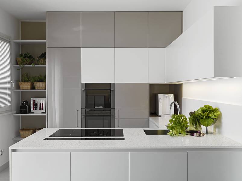
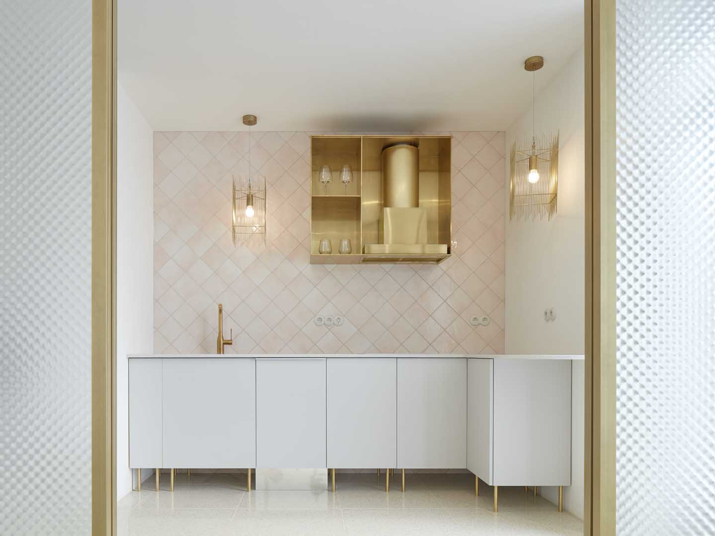
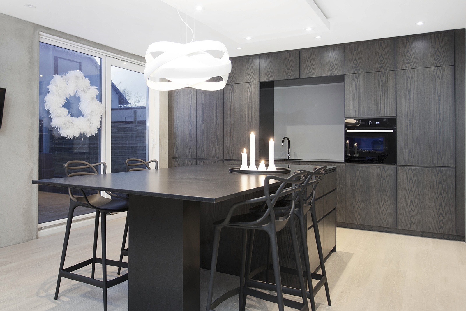
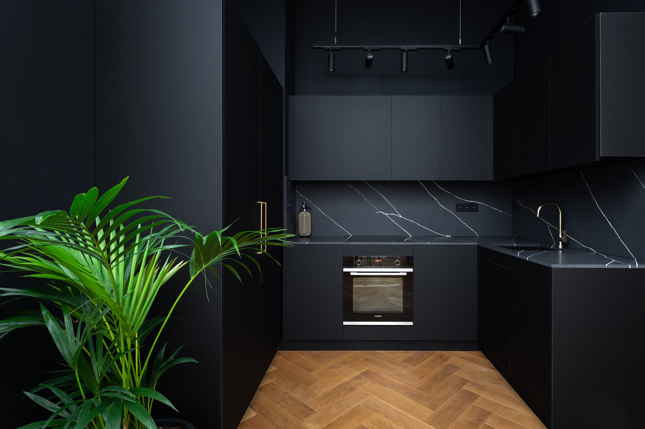
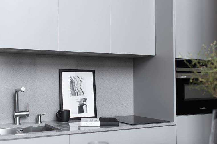
Dark gray is suitable for warm colors, light for cold colors. But it can withstand wood in any shade.
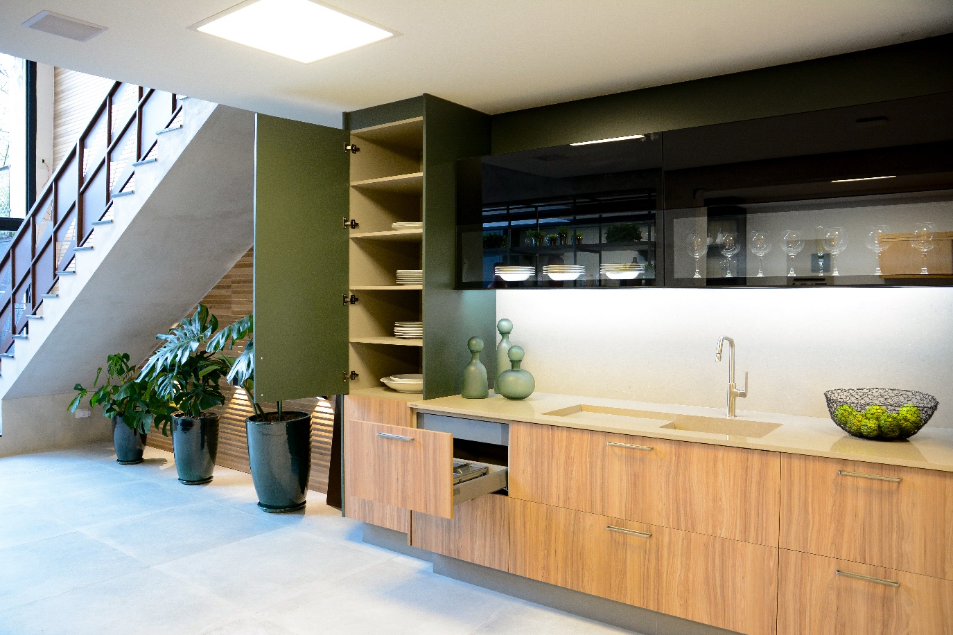
Gray is like a February landscape, in which it is not yet clear what beauties germinate in its depth and wait for what will hatch to the surface. Clean and sophisticated, a bit mysterious, with a lot of elegance. It suits large areas and with its neutrality provides a wonderful basis for using any other color in the future. And really any at all. From phosphorescent yellow to pastel pink, gray is like a bridge that can connect two seemingly completely incompatible colors and add harmony where white or black looks too sharp.
Gray is a suitable color for children’s nurseries, which will grow together with its young inhabitants but also as a basic shade for investment housing intended for rent.
“When we renovated the apartment, which was intended for medium-term rent for at least ten years, we wanted to create a neutral home that would appeal to everyone and at the same time not look cold and create a cozy impression. Therefore, there are several areas of gray, including a kitchen unit, sofa bed and built-in wardrobes in the bedroom. We complemented everything with wooden furniture, textiles with blue and brick accents, and our tenants admired the combination so much that it inspired them to do the same in their home countries” exalts Aneta Přesličková, the owner of several rental properties.
We are not afraid to claim that from the reigning black and white, the color of lava stone and pigeon wings emerges as a gray eminence on a palette of the most beautiful colors, which we recommend with confidence. And because it’s the color of sobriety, everything here applies in moderation, or at least as much as it does to you.